- Apple releases the third beta of iOS 18: the public beta is coming
- iOS 18 allows us to easily restart the iPhone through Control Center
- Forget iOS 18: Apple has already started the development of iOS 19

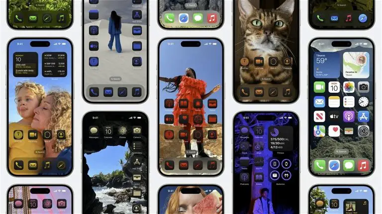
iOS 18 will always be remembered as the version that allowed for customization of the iPhone’s home screen. It offers options that allow you to change the color of the icons and place them freely on the home screen, as well as making them larger in order to hide the name that appears below them and that of the widgets.
When you go to customize the Home screen on your iPhone or iPad, you have several options. Among them, the possibility to choose the color you want for the app icons; However, this is only available in dark mode, tinting the icons black or dark, along with your chosen color. And this is not to everyone’s liking.
The icon tint option needs a clear mode version
As I told you, the option to dye the icons the color you want implies putting a black or dark base; There is no option in clear mode. And this is just what could be changed to improve these new customization options in iOS 18.
As we can see in the concept that developer David Smith has shared on Mastodon, an option that would put the background of the icons white and then apply the chosen color, would look quite good, in addition to being very popular.
David Smith is the developer behind the famous Widgetsmith app, an application that was born as a response to the widgets that were included in iOS 14 and that has become the customization app par excellence by offering not only widgets, but also customization options for them.
As he points out in the post in which he has shared the concept, the most famous themes of Widgetsmith are those with light backgrounds, specifically, four of the five most used within the app have light background tones, two of them being completely white.
The developer handles very firm data, because Widgetsmith is a very popular application among customization lovers. Users that Apple should pay attention to by adding that option in light mode when tinting the icons. It would also be a good way to gain the attention of those users who are not using it, like me, who with that option could consider using it.

Comments