- Android 15 would put an end to Google’s fast charging problem
- Android 15 Beta 3 is now available for download: all the news
- Official: the CMF By Nothing Phone (1) will be presented on July 8 along with two other new products

Carl Pei has not been able to contain his enthusiasm for the new version of Nothing OS that they have in their hands and has decided to publish on his official X account, formekrly Twitter, a couple of news that will land together with the launch of Nothing OS 3.0 that will take place over the next few weeks.
This update to the Nothing customization layer does not have a fixed release date, although it is expected to come to light alongside the release of the special edition of the Nothing Phone (2a). Yes, the cheapest device from Carl Pei’s company will have a version that will bear the surname ‘Community Edition’.
Nothing OS 3.0 is shown: this is what some of its new features will be like
What Carl Pei has shown are not features that are going to revolutionize the way users interact with devices, in fact, quite the opposite. These information pills serve to increase the eagerness to launch Nothing OS 3.0.
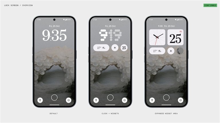
Specifically, it has been seen that the lock screen will have three styles from which you can choose. The first is the default classic that can be seen on any Nothing mobile, the other two are the ones that present new features and are called :
- Clock + Widgets
- Expanded Widget Area
The names explain the new features of these features, Clock + Widgets allows you to have both the clock and a series of widgets on the lock screen with reduced size. Aesthetics, in this case, continue to give the watch a predilection.
While in Expanded Widget Area what it shows is a lock screen in which widgets have a greater role. In fact, the area dedicated to these elements covers a third of the screen. The widgets that have been integrated are:
- Clock
- Calendar
- Time
- Contacts
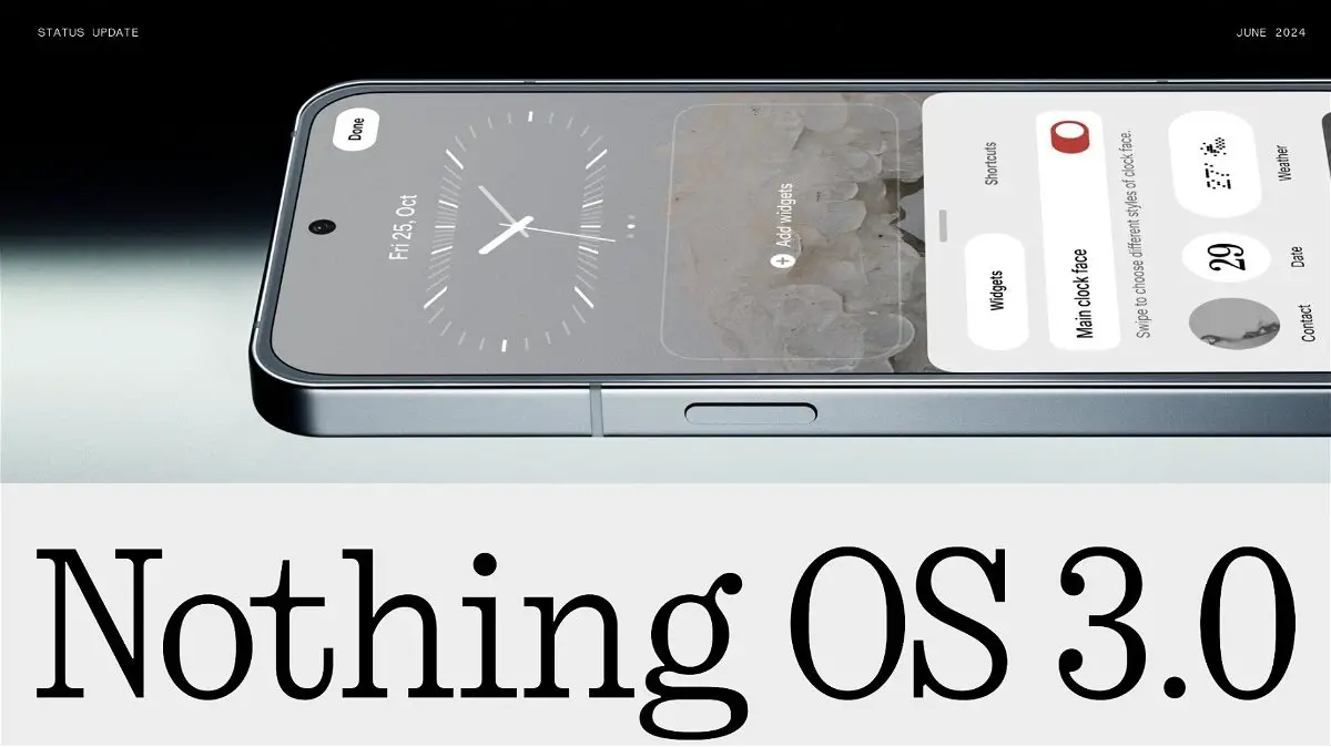
Of course, in the second first image of its publication in X you can see the lock screen settings section. The options shown suggest that you can choose the design of the clock and also the widgets that can be added to the area intended for them.

It will be interesting to see if any widget can be integrated within the lock screen, although Nothing has most likely reserved this feature for widgets that own their apps. For the time being, we will have to wait for their launch to see the practicality of these designs.

Comments